
U.S. State Department Apologizes After AI-Linked Africa Map Mislabels Every Country at Global AIDS Conference
U.S. State Department Apologizes After AI-Linked Africa Map Mislabels Every Country at Global AIDS Conference A presentation by the U.S. State Department at a major global AIDS conference in Rio de Janeiro has sparked international criticism after an Africa map shown to attendees misidentified the locations of countries across the continent. The embarrassing error occurred...
Graham Dough
Jul 30, 2026 · 3 min Read
Key Highlights
- 🌍 A U.S. government presentation showed an inaccurate map of Africa at the AIDS 2026 conference in Rio.
- 🤖 Reuters found an AI-related watermark on the map image.
- 🇳🇬 Nigeria was incorrectly shown as landlocked in the Sahara.
- 🇲🇿 Mozambique was placed near the Horn of Africa rather than southeastern Africa.
- 🇨🇮 Ivory Coast was also shown in the wrong part of the continent.
- 🙏 The State Department apologized and said it took full responsibility.
- 💊 The incident occurred during discussions about U.S. HIV/AIDS assistance and PEPFAR.
U.S. State Department Apologizes After AI-Linked Africa Map Mislabels Every Country at Global AIDS Conference
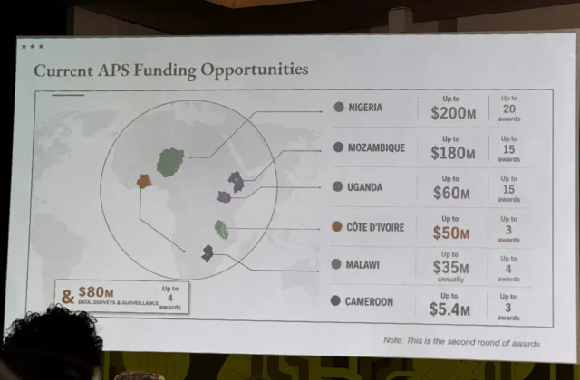
A presentation by the U.S. State Department at a major global AIDS conference in Rio de Janeiro has sparked international criticism after an Africa map shown to attendees misidentified the locations of countries across the continent.
The embarrassing error occurred during a presentation about new U.S. health agreements at the AIDS 2026 conference. Reuters reported that the map appeared to contain an AI watermark associated with OpenAI tools, while the State Department said a staff member had hastily changed the presentation before the event.
The department subsequently said it took full responsibility for the confusion and misrepresentation caused to attendees, including African partners.
What Happened at the AIDS Conference?
The incident occurred during a State Department presentation at AIDS 2026 in Rio de Janeiro, Brazil.
The presentation focused on new U.S. health agreements and included a map intended to illustrate countries and regions connected to the department’s programs.
Instead, the map immediately attracted attention because the country labels did not correspond to their actual geographic locations.
Reuters reviewed video of the presentation and reported that the map appeared approximately halfway through the presentation.
Screenshots were subsequently shared online, turning what might have been a routine presentation error into an international news story.
The Map’s Most Striking Errors
The errors were not limited to a single country.
According to Reuters, Nigeria was shown as a landlocked country in the Sahara Desert, despite being located on the Gulf of Guinea in West Africa.
Mozambique, which sits along southeastern Africa’s Indian Ocean coast, was moved toward the Horn of Africa.
Ivory Coast, a West African country on the Gulf of Guinea, was also positioned on the opposite side of the continent.
The result was a map that failed at one of the most basic functions of a geographic illustration: accurately showing where countries are located.
Was Artificial Intelligence Used to Make the Map?
Reuters reported that its analysis found an artificial-intelligence watermark on the map image, indicating that it had been created using OpenAI tools.
That detail has added another dimension to the controversy.
AI image-generation systems are known to struggle with tasks requiring precise spatial relationships, labels and geographic accuracy.
A map, however, is particularly sensitive to these errors because even small mistakes can completely change the meaning of the information being presented.
Reuters said OpenAI was investigating the report.
The State Department did not attribute the geographic mistakes directly to AI. Instead, it said the map had been produced by a team member who hastily changed the slide deck before the event.
State Department Takes Responsibility
The State Department acknowledged the mistake rather than disputing the obvious inaccuracies.
In its response, the department said it took “full responsibility” for the confusion and misrepresentation experienced by attendees, including African partners.
The department also emphasized that the wider discussions at the conference remained substantive and constructive.
It reiterated its commitment to fighting HIV/AIDS and achieving measurable results.
Why the Mistake Is More Than an Embarrassment
At first glance, the incident might appear to be nothing more than an embarrassing presentation mistake.
But the context makes it considerably more significant.
The map was presented at an international conference focused on HIV/AIDS, with African countries and organizations among the stakeholders.
The United States has played a major role in global HIV/AIDS programs for decades through PEPFAR — the President’s Emergency Plan for AIDS Relief.
That means geographic accuracy matters.
Programs dealing with healthcare funding, treatment, prevention and disease surveillance depend on precise information about countries and populations.
The PEPFAR Connection
The presentation was led by Jeff Graham, the U.S. health envoy responsible for overseeing PEPFAR, according to Reuters.
PEPFAR has historically been one of the world’s largest international programs addressing HIV/AIDS.
The program has supported treatment, prevention and health systems across numerous countries, particularly in sub-Saharan Africa.
The map appeared during a period when the future of U.S. international health assistance is already receiving significant scrutiny.
U.S. Foreign Aid Is Already Under Pressure
The controversy comes amid major changes to U.S. foreign assistance.
Reuters reported that the Trump administration paused funding last year while conducting a review, disrupting aid programs around the world. Core PEPFAR activities, including the provision of life-saving medicines, have largely resumed, but other spending areas such as prevention and surveillance are being reduced.
The United States also plans to fully phase out the PEPFAR program in South Africa, according to Reuters.
Against that backdrop, an inaccurate map shown while discussing U.S. health assistance inevitably attracted additional scrutiny.
Why AI Accuracy Matters in Government
The incident also highlights a growing challenge for governments using artificial intelligence.
AI tools can produce impressive images, documents and presentations within seconds.
But visual accuracy is not guaranteed.
A system can create something that looks professional while containing fundamental factual errors.
That is particularly dangerous when AI-generated or AI-assisted material is used in:
- Government presentations
- Healthcare communications
- Financial reports
- Scientific research
- Military briefings
- International diplomacy
- Public policy documents
The Africa map controversy provides a powerful example of why AI-generated material needs human verification before it reaches a public audience.
Could This Damage U.S. Relations With African Partners?
The State Department’s acknowledgment that the mistake caused confusion among African partners demonstrates why officials took the incident seriously.
For countries whose geography, institutions and national identities are being discussed, seeing their countries incorrectly positioned can be viewed as more than a simple technical mistake.
It can reinforce concerns about whether policymakers fully understand the regions where their programs operate.
That is particularly sensitive when the subject is healthcare assistance involving billions of dollars and millions of people.
The Bigger Issue Behind the Viral Map
The map itself may soon disappear from public attention.
The larger question is likely to remain:
How much should governments rely on AI when accuracy is critical?
AI can help governments produce materials faster and reduce workloads.
But speed cannot replace verification.
A human reviewing the presentation should have been able to identify that Nigeria, Mozambique and Ivory Coast were not located where the map showed them.
That makes the incident a reminder that AI-generated content still requires human oversight.
What the State Department Says Now
Despite the map error, the State Department says the conference discussions were productive and that the United States remains committed to fighting AIDS.
The department’s response effectively separates the embarrassing presentation mistake from its broader health policy.
Whether the explanation satisfies critics remains another question.
The controversy has already spread beyond the conference room, however, with screenshots circulating widely online.
Final Thoughts
The U.S. State Department’s incorrect Africa map has become an unexpected global story because it combines three highly sensitive issues: AI, American foreign policy and global healthcare.
The geographic errors were striking enough to attract immediate attention, while the reported AI watermark raised questions about how the image was created and reviewed.
The State Department has apologized and accepted responsibility.
But the incident offers a broader lesson for governments, companies and news organizations:
AI can create information quickly, but humans still have to make sure that information is correct.
In a government presentation involving international partners and public-health programs, that final verification step can matter enormously.
❓ FAQs
What happened with the U.S. Africa map?
The U.S. State Department displayed a map at the AIDS 2026 conference in Rio that incorrectly labeled countries across Africa.
Which African countries were misplaced?
Reuters specifically identified major errors involving Nigeria, Mozambique and Ivory Coast. Nigeria was shown in the Sahara, Mozambique was shifted toward the Horn of Africa and Ivory Coast was placed on the opposite side of the continent.
Was the map AI-generated?
Reuters found an AI-related watermark associated with OpenAI tools on the map. The State Department said the map was produced by a team member who made hurried changes to the presentation.
Did the State Department apologize?
Yes. The department said it took full responsibility for the confusion and misrepresentation caused by the map.
Where did this happen?
The presentation took place at the AIDS 2026 conference in Rio de Janeiro, Brazil.
What is PEPFAR?
PEPFAR is the President’s Emergency Plan for AIDS Relief, a major U.S. government initiative supporting the global response to HIV/AIDS.
Why is the incident significant?
Beyond the geographic error, the episode has raised questions about AI verification, government communications and the reliability of AI-generated material in high-stakes settings.
📰 About The Business Now
The Business Now delivers coverage of U.S. politics, global affairs, technology, AI, business, finance, science and major breaking news with fact-based reporting and analysis.
🪙 Check Live Gold Prices
Track Gold, Silver, Platinum and Palladium prices, historical charts, calculators and daily market updates at:
🌐 External Resources
Keep reading
Related Articles
 Commodities
Oil Nears $95: Could the Iran War Trigger a New U.S. Inflation Shock?
Oil at $95 Is Not the Real Story A crude-oil headline is easy to write: “Oil prices rise as Iran tensions escalate.” Reuters, Bloomberg, CNBC and WSJ can publish that story within minutes. But for TheBusinessNow, that isn’t enough. The bigger question is: What happens to the American economy if oil stays near $95 —...
 Economy
U.S. National Debt Hits $40 Trillion: Why Treasury Yields Are Rising Again
The $40 Trillion Number Is Not the Whole Story The United States has crossed a psychological and financial milestone. $40 trillion. But simply writing “America owes $40 trillion” misses the more important story. The real question for markets is: Who is willing to finance America’s growing debt — and at what interest rate? That question...
 Commodities
Strait of Hormuz Standoff: The Oil Shock That Could Hit the U.S. Economy Next
Strait of Hormuz Standoff: Why the Oil Market Is Getting Nervous Again The oil market is being forced to price a problem that seemed to be easing only weeks ago: the Strait of Hormuz is still not reliably functioning as a normal commercial shipping route. On August 19, Brent crude was trading around $91.20 a...
Comments (0)